Junglebook: Simple Kindle Ebook Cover Analysis
I got myself good and distracted from my regular project work and ended up writing the start of a little script that I’m calling JungleBook. It’s makes images that are pretty and interesting… and might just provide a little bit analytical benefit.
Story time
Anyone else familiar with Pat David? Well, you should be. He’s a super-cool guy that who runs PIXLS.US, a site dedicated to photography with free and open source tools. However, that’s not why I bring him up. A few years back, he was playing around with using ImageMagick to generate an average blending of images. He’d pull in magazine covers, all the frames in different films and music videos, and portraits of U.S. presidents. However, what really got my attention was a piece he did wherein he averaged the top 50 suggestions that Netflix made to him, by genre.
He did all of that a few years ago, but I only recently stumbled across that work… and it got me thinking (dangerous, I know).
See, as I’ve been involving myself more with writing and designing books, I’ve noticed a few common suggestions keep popping up. One of those pertains to book covers. There’s a [valid] recommendation that if you want your book to sell in a particular genre, go look at the bestselling covers in that genre and recreate their look for your book. The logic behind this suggestion is that people, as purchasers of media, aren’t particularly interested in things that are new and wildly different, regardless of what they say. This is especially true of genre readers. They may appreciate original perspectives after purchase, but before they buy, their goal is to re-experience what they’re already comfortable with. You want to design a cover to meet that expectation.
So when I saw Pat’s Netflix piece, it got me curious. What if I used that process of averaging images on ebook covers in categories within the Kindle store? What would it tell me about color choice and composition for various genres? I had to find out.
However, there’s a problem. I’m lazy.
Going through each genre on Amazon and manually downloading the top 50 book covers in each one would be a lot of work. Boring, tedious work. So I did what any lazy person does… I reached for technology and wrote a little Python code. Amazon, being a technology company, has developed a nice, convenient API (application programming interface) for their store… a way for code to talk to it. The idea is to make it easy for advertisers and sellers to use Amazon’s data on their websites for easy purchasing. So with a little light research on the API, I was able to cobble together a handful of lines of code that would suck down the top 50 ebook covers in whichever genres I wanted. Then I’d just need to use Pat’s basic technique and make those averages (also scriptable). Sweeeeet.
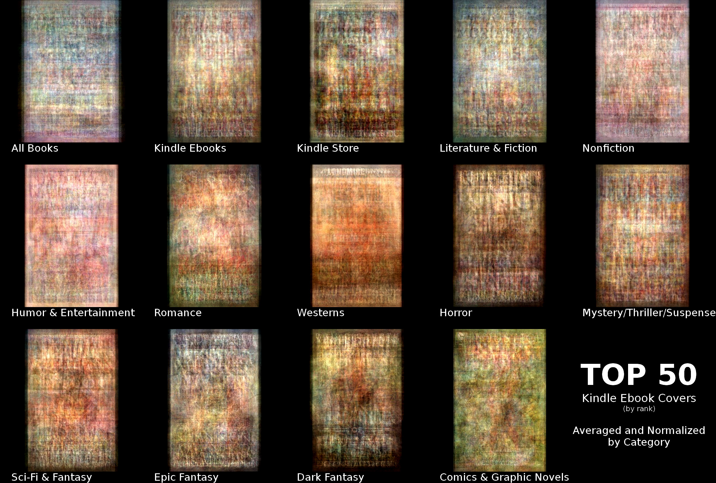
The results
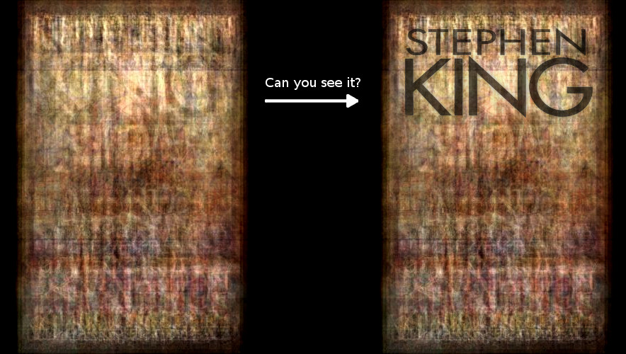
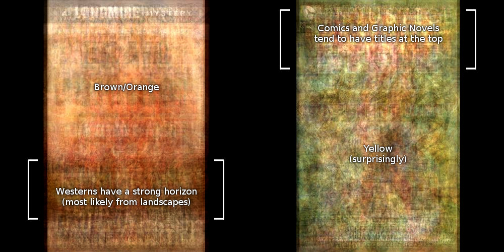
The results (as shown in the top image of this post) might just appear to be an interesting mess (as a friend of mine said, “doesn’t it just mean that all book covers look alike?”). However, if you look closely, there’s a lot of cool things that can be learned. We can start with the obvious stuff. For instance, titles and author names are typically at the top or bottom of covers in most genres. You can tell that by the large horizontal blocks of vertical lines that are focused at the top and bottom of most of those images. Nonfiction and Humor covers tend to use brighter colors overall. Westerns use mostly brown and orange hues (sand and the dusty plains… go figure). Stephen King shows up in the Horror genre so much and his titles are placed with enough consistency that it very easy to see a giant KING at the top of that genre’s composite.
But there are some unexpected and interesting things learned from this exercise, too. Take a look back at the combined image for Westerns. See that dark, strong horizontal bar across the bottom? How much do you want to bet that a lot of Western genre book covers feature a wide landscape or sunset/sunrise shot? And it’s easy to see that most comics and graphic novels put their titles at the top of the cover, but who would’ve guessed that yellow would be in so much use in that category? It’s even more striking when compared against the other categories.
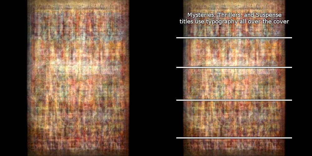
Here’s a fun one: check out the mix from the books in the Mystery, Thriller, and Suspense category. There are a four very distinct horizontals almost evenly spaced along that image. Books in that genre don’t stick to keeping their titles at just the top and bottom. Oftentimes, those covers are very sparse on imagery and consist of just the typography over the whole cover. Nonfiction covers are similar, but the titles tend to be less bold, so you don’t end up with those four distinct regions.
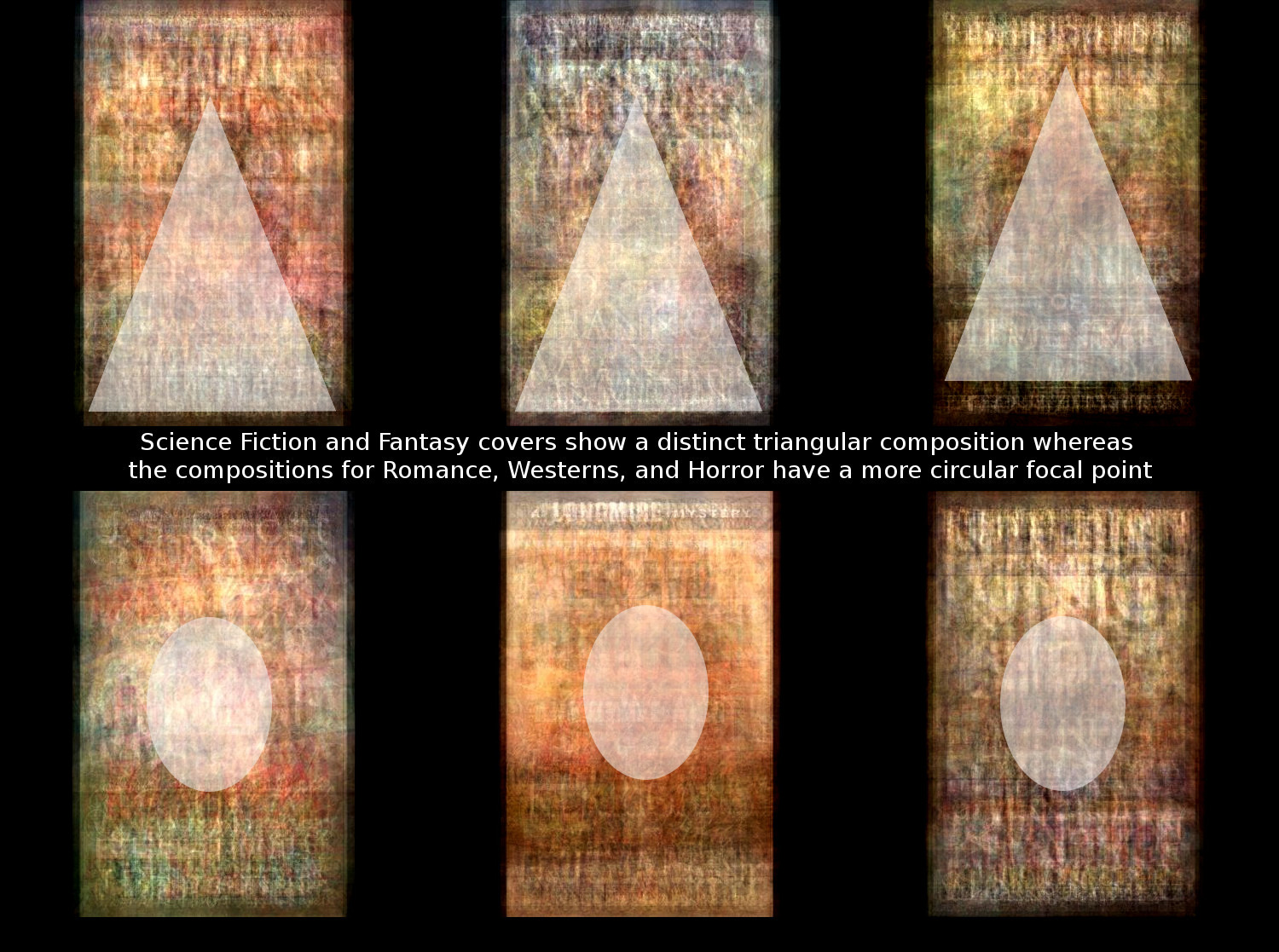
My favorite composition thing to note comes from the three fantasy-based categories: Science Fiction and Fantasy, Epic Fantasy, and Dark Fantasy. These three have a very noticeable compositional triangle on their faces. Romance, Westerns, and Horror have similar focusing, but the shape is more oblong than triangular.
What’s next for the JungleBook script?
So this little chunk of code’s got me some pretty cool results… and pretty quickly (laziness FTW!). I’ve gotta say I’m pretty happy. Once I clean it up a bit, I’ll probably push Junglebook to my GitHub account and share it around. At the very least, that’ll make sure it doesn’t get lost on my hard drive. In the best case, perhaps a better programmer than me can find a cleaner, more elegant way to generate images like this… or even more interesting images that reveal more design hints and tips.
Of course, now my mind is spinning with all kinds of other cools things to look into. For instance, Amazon updates the bestsellers list on an hourly basis. What if I tracked the number one book in each of these genres for a month and averaged those together? What might that tell us? Or consider the fact that I’ve only looked at a pretty small representation of all the different categories in the Kindle store. What if I set up a website that would generate a top 50 averaged images for any category on the fly per user request? Or what if I did these averages every day for a month and then animated them to see how the average changes throughout the year? If I did it for multiple years, we could see if there are seasonal shifts and trends.
There are so many different possibilities here that I’m not entirely sure where would be the best place to start. So guess this is where I drop in the question(s): What would you like to see? What would be most useful? What do you think I should do next?